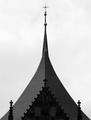
There are a lot of triangles in the picture, although I think the key element is the sphere of the building. That aside the picture has no punch in b&w. There needs to be more contrast, every thing just seems grey.
Great job seeing this structure to illustrate repeats. I would have darkened this a little bit by curves or leves to show more differences in tones. If you have a chance to go back and take another shot, you might want to place the trees/shrubs more to the side (either left or right), rather than the center because they hog attention more than the globe. Move around with your camera until you find a location to shoot without the distraction.







 Add photograph to your favorites
 Add photographer to your favorites


 Photographer found comment helpful.


