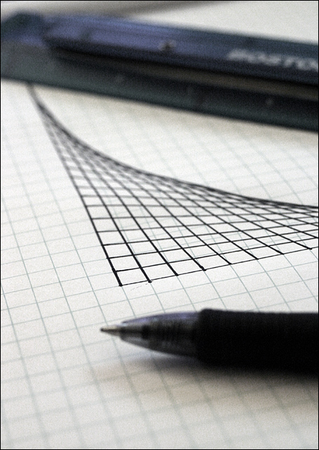
The dof choice doesn't work for me here, although this image i think has a lot of potential. I most like the minimalist set up and composition. I do feel this should be "moodier" with perhaps a different lighting choice to create a darker, less black and white tonalities.
I like the 3-D image that was created by the drawing. Using shalloy DOF gives more depth wich accentuates the 3-D element, that's a nice touch. The composition however, doesn't seem to worl for me. It doesn't mesure up to the brilliance of the concept. The pen and ruler should either have more light on them or be of a light color. Tough one to vote on. Good luck!







 Add photograph to your favorites
 Add photographer to your favorites


 Photographer found comment helpful.


