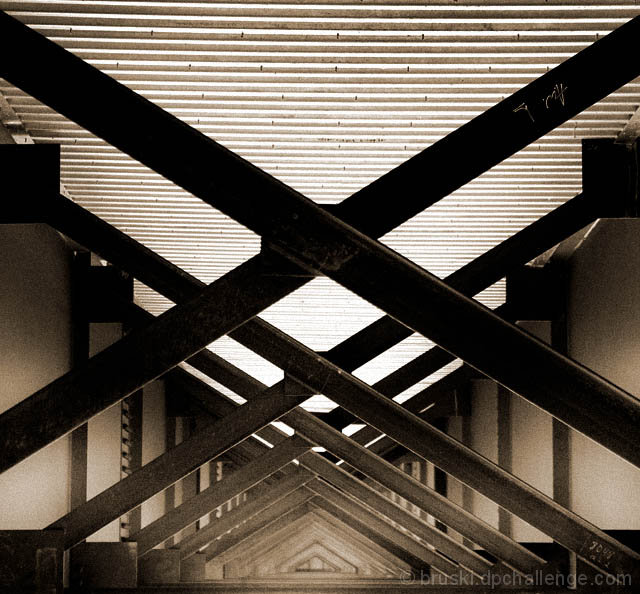
I have decided that from here on out, I am only going to shoot things for myself. I have decided that I could never guess what will do good on this site anymore. So I will enter shots that still are based on the challenge theme, but I will not try to conform to the happy stock style images unless it is one I like. This is my first entry with this mindset. I added grain and went with a high contrast look. Then I colorized the image to have a faded sepia look to it. These are things I would do for myself but not for a DPC entry. So from here on out I will just have to let it ride, and if i get low scores oh well. At least I know I will be happy with the product.
Statistics
Place: 23 out of 413 Avg (all users): 6.0179 Avg (commenters): 7.2308 Avg (participants): 5.8553 Avg (non-participants): 6.2109 Views since voting: 1238 Views during voting: 361 Votes: 280 Comments: 19 Favorites: 1 (view)
Very interesting composition and subject matter. This must have been hard to shoot, with that bright light above, causing all else to go dark. however, I like the sepia toning and grain makes this a more artistic piece. I especially like the how the beams create tight little triangles in the bottom center. It would be interesting to see what the original photo looks like.
nice use of repetition, and one of the better perspectives for repeated triangles in the challenge. i usually like grain in an image, but for this i feel a softer look would be more effective. 9
Love the grainy feel.. would have almost been better to crop off the top third to give more attention to the (more interesting) lower half of the image. 7
I like the grain and top/bottom contrast. some marks onthe beams would presumably go with spot editing. slight loss of detail in the middle, but does not hurt this pleasing image.
Beautiful colours and a succesful composition but for my eyes your photo is a little bit too disordered. Maybe if you cropped the upper half the title "triangle" would be better visible.
Beautiful repeating pattern. Very graphical - with lines, repetition, rhythm, the works. Symmetry works well except that its off on the horizontal. But who's minding it?
Wow, really cool. Neatimage might be able to reduce the noise on either side but I figure the light must have been pretty low in there so the high ISO is understandable. Great symmetry, fits the challenge perfectly - only little detracting thing is the noise, but even then the noise may add to the photo in some ways. Nice job, 8.





 Add photograph to your favorites
 Add photographer to your favorites

 Photographer found comment helpful.


