Thanks for all your comments! This picture got more comments than anything else i've submitted.
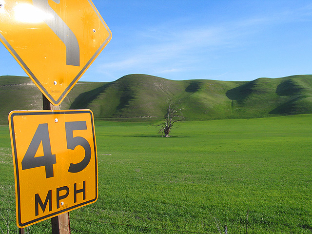
If you were wondering, yes, I did put the sign in there on purpose. I thought the "institutional" yellow of the sign was a stark contrast to the lush green of the hillside. As far as the "blowout" on the sign, I actually liked the effect.
FYI: This is the same tree I shot for the texture challenge in July of last year, as suggested by Swashbuckler.
Composition - There is some awesome color and texture to this shot. I'm still not sure where the sign fits in, but to each his own. I think sacrificing the sign in order to lose the wires at the bottom and the washed out part at the top is a fair trade. But that's just me. The grass is wonderful, like the fairways at Augusta. The hills have cool little bumps that make cool little shadows. The sky is a great shade of blue. Nice work.
Technical - Great color, exposure, use of available lighting. The shot is really crisp and clear. Really nice work.
Overall - I don't think I'm the only one wondering about the sign judging by the comments. I really don't think it needs it. There are some great colors and nice textures to this pic. I reminds me of the Teletubbies, if you know who they are. This is a nice pic with or without the sign in it but I think it allows for some more criticism as well. Good luck in future challenges - Inspzil
Wow! I think there are two imperfections here that keep the photo from a 10. 1.) The glare on the top of the sign. 2.) The little twig sticking up in the lower right (barely discernible.)
Yikes! The reflection at the top is hurtful on the eyes. Actually, minus the sign, this is a good shot. Just try that...crop your version from the sign over. The single tree is a good marker, the taller than wide crop works here...it's good! :)
I like the simplicity of this photo and the clean lines. Too bad about the glare on the sign, but I am guessing thats the sun, so you can't do much there lol
If it hadn't been for the nasty glare on the sign this would have ranked higher in my book. Actually, I think you could have dropped the sign all together out of the photo and I would have ranked it high. I love the greens and that lonely tree.
Great color! I would have given this a 10 if it weren't for the flare in the sign. The tree placement is nice. (9)
- after reviewing your photo (and others) I bumped this one to 10!
I wish you would have kept the curve sign out of the picture. For that matter the whole sign. I love the color of the green grass and the blue sky. Sorry for not giving you a 10 due to sign....
With 45 miles per hour for the name you should have taken out the upper part of the sign as with the glare on it the focus is aimed at it in general. Good idea but needs work.
This is nicely composed and has a simplicity about it. The glare in the upper left part of the sign, however, distracts from the quality of the rest of the shot.
If not for the glare on the sign, definitely a 10 This looks almost like the default background for windows xp, and the 3-dimensional quality is really cool
Since you are proably geting knocked for the glare I won't comment on that . .oh well guess I did, anyway except for that you have a great image. The yellow contrasts nicely with green, and color is very much a player in the shot.
Strange, looks like telle-tubbie land. I sure you've heard people complain about the glare on the sign. I wonder if the sign wasn't in it at all, if it would have been better.
Very nice photo with great composition and especially color. :) It's just to bad the upper part of the sign has such a bad glare. Still, it's agreat entry for this week's assignment. 8
Not really sure why this sign is in the picture to be perfectly honest. Looks like a fine shot without it. I would've just kept the little skinny tree as the focal point of the photo and captured that wonderful green carpet. By including the sign, you also include the wires at the bottom.
Nice, clear color in everything except for the bright glare in the upper left hand corner which is a bit distracting. Other than that, the picture hardly seems like it's real. Good shot.






 Add photograph to your favorites
 Add photographer to your favorites


 Photographer found comment helpful.


