I like this picture a lot.
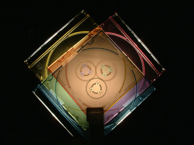
Very original idea, and very well executed. I like the abstract touch. My eyes keep being captivated by the shapes. I guess this is the reason you didn't do better at the time of the challenge: this picture is not focused enough on colors. The shapes are too complex: they drive the attention.
But outside the original theme, it is an excellent picture IMO.
This is an excellent color shot... I really like the abstract nature of it. It took me a while to figure out what I was looking at translucent and colored CD cases...
I read through all your 'nice job' comments :) No one really wanted to step up to the plate for you on the comments this week...
Compositionally, I think you could have created a higher impact by going with a square frame rather than rectangluar. Why? Because the 'centered' composition can be a little awkward sometimes. I believe that when you have an image such as this one, using a square frame with less empty space on both sides works better. Your image is still centered, but it doesn't really jump up and scream 'centered orientation' when it's in a tighter square area.
Interesting idea and pattern. I think overall the colors are a bit darker than I'd like, especially along the edges. The holder is also necessary BUT distracting.






 Add photograph to your favorites
 Add photographer to your favorites

 Photographer found comment helpful.


