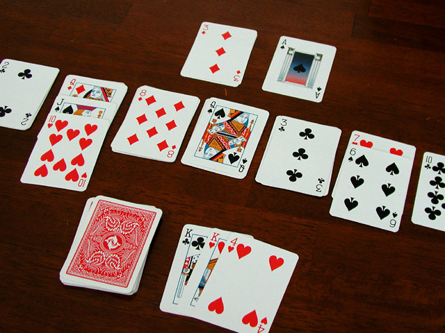
I love solitaire! Trying to figure out which of the gazillion versions out there you are playing . . . Shot is nice and focused, I like the idea of cropping the edges of the cards to show that there's more than just what's visible, but I'm wondering if I wouldn't try to crop this shot even tighter, (maybe turn it into a portrait shot?) to get rid of more of the background. Just a thought.
At first I thought the background on this shot was too plain, but the more I look at the shot, I realize that it fits in well with the subject -- solitaire. It was something that grew on me, unfortunately I'm sure a lot of voters don't look at the pictures long enough to pick up that kind of subtlety. The plain background gives a feeling of isolation and quiet that fits well with the theme. Also, the arrangement of the cards does a good job of leading the eye across the picture. Nicely done.
The angle helps give this a little bit of life. I think I would have stopped way down on the aperture to get maximum depth of field -- if possible, maybe you were already there. The cards in the background are just out of focus and this would help make them sharper. Or, open way up and choose where you want your focus to be and let everything else be more unfocused. Take your pick. :-)
I like to play solitaire too! I am asking myself why you may have chosen to clip the cards on each edge of this frame... I think I would like either a tighter view showing less cards or a wider view showing all the cards rather than losing someting on each edge of the frame... Nice shot!







 Add photograph to your favorites
 Add photographer to your favorites


 Photographer found comment helpful.


