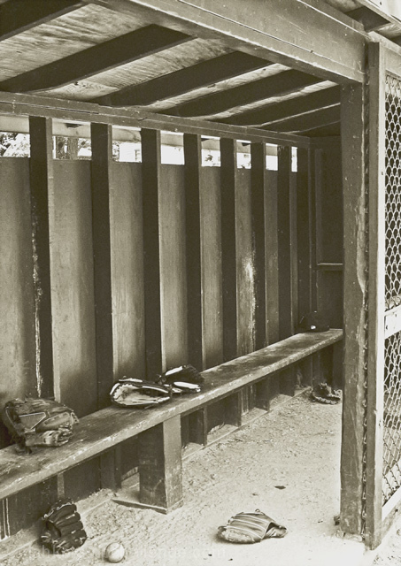
This does lack contrast, but NOT interest. It seems to be caught between a B&W and a sepia. I suspect the low-side scores are about that or about its "fitness" for the challenge. Given that you have only 13 votes below a 4, and 16 above a 6, it's not so bad. Perhaps another one worth revisiting. (I know, we get so sick of an image during a challenge that it's hard to see it that way, but the long-view is nice sometimes.)
I llike the cepia tone. It gives it an old-timey baseball look. Baseball pictures always touch my heart, being the baseball freaks me and my family are :)







 Add photograph to your favorites
 Add photographer to your favorites

 Photographer found comment helpful.


