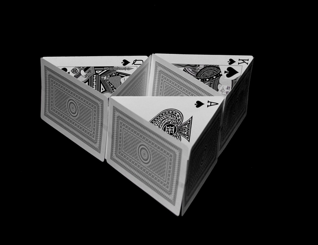
I think this shot could have been better if the formation was straight, slightly off center and the front cards are a bit out of focus. good concept tho.
Simple and effective design, attention to detail choosing the cards, and finished off with a nice b/w conversion. While I wasn't keen on all the other house of cards renditions, I find that I like this one a lot. 9
lol nice shot... i like the tower being on its side... the only thing wrong is i can see the tape... haha, nothing could be done though with basic editing... 7
Awesome shot. Lighting and focus are superb. Great composition. Nice detail. Good b/w conversion. Using the A,K,Q of spades, perfect touch, although I would have flipped the ace around, so it was in same direction as others. Very nice job.







 Add photograph to your favorites
 Add photographer to your favorites

 Photographer found comment helpful.


