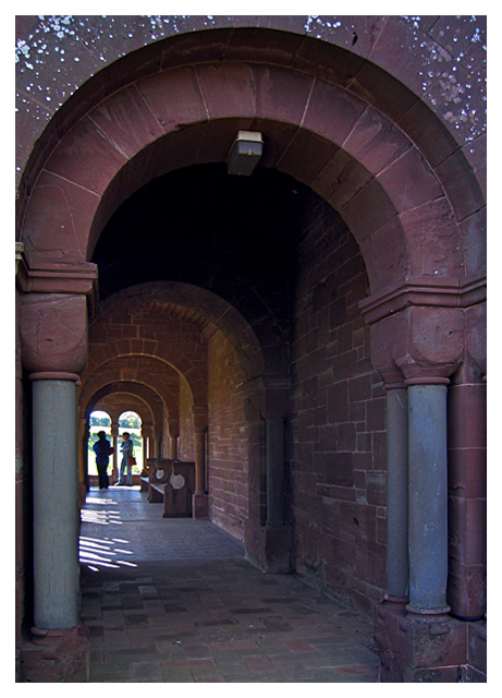
This is one of those photograph that has such strong appeal, but just did not quite hit the mark. The repitions of the columns and the angel at which you took it are absolutely wonderful. There is a feeling of invitation to walk down this path, to immmerse oneself further into the photograph.
I am feeling that the colors are a bit muted and that might be because of the time of day this was taken. I think I would prefer a bit more saturation of the colors and a higher contrast. I have read the other comments you have received, and I would agree that Black and White might be an interesting way to go with this. Unless the colors are a primary part of the photograph, Black and White can bring out more of the "feeling" of a place.
Overall this is not a bad photograph, and has true potential to move into greatness.
Did you try this in black and white? it might have been more effective? Also although you might have gotten marked down for it, I think in this case, slightly blowing out the light might outside might have looked slightly more artistic. Just some ideas to try.






 Add photograph to your favorites
 Add photographer to your favorites

 Photographer found comment helpful.


