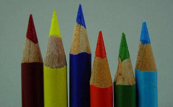
This shot looks like it needs some better lighting. In my opinion, it is essential that this background comes out as a crisp white, so taht the colors contrast effectively with the white. Using a solid white background and a more powerful light would increase the impact of the colors in this shot by a lot. Some post-processing to brighten and increase contrast could help as well, but the adjustments would be more effective if they were made in the process of shooting.
a familiar idea, and you've managed to capture a lot of detail of the pencils, but the picture could use a greater exposure to really brighten up the colours!
I think this picture meets the challenge well but it could use a little more work. I think all you really need is some post processing to really make this one pop. I would start with adjusting the color and brightness so that the background isn’t so drab. The whole picture appears to be a bit underexposed and the colors aren’t as bright as they could be. I would suggest upping the contrast about 5 or 10% and upping the saturation 5% or so. You can also play around with setting a white point from the background. Finally I would add a bit of USM to sharpen it up a little more and I think you will have a very good picture here.
As it is now I gave it a 4.
A good idea but the lighting lets this down - it is very flat and the white(?) background has been underexposed so much to come out grey. This would be a good use of the exposure compensation features of your camera if it has any.







 Add photograph to your favorites
 Add photographer to your favorites


 Photographer found comment helpful.


