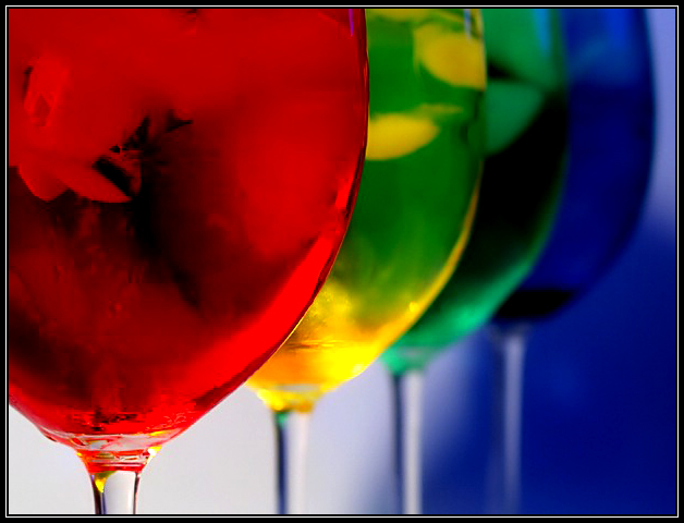
The yellow glass looks like an alien or something. It's too bad the green shows through - maybe if you put this out of color order and put the yellow last, it could have looked like each one was its own? I like the blue background behind the subject - that's perfect.
Really nice colors here. The focus feels a bit off to me although I'm not really sure why. Maybe if the second glass was more in focus too. Nice background lighting.
I love composition of this photograph. The background blends with the last blue glass and gives great depth to the photo. I also like the way the green colour bled through the yellow drink, gives it a wild mixed look. 9
You have a very nice submission for the color challenge here. This image is technically very well done I love the colors, the composition and the use of depth of field. It is a very tastefully done rainbow without it being too obvious. This picture blows away any of the other entries that I have seen so far. There isn’t anything I can think of that could improve this picture at all. I gave it a 10.
I think the DOF you have chosen, providing for the decreasing focus, really pulls my eye to where it should, and makes me see the "progression" of colors. I love it. 8.
Initial thoughts I really like this – I find it very intrigueing.
Composition/ Content I think the composition here is superb – a very strong abstract – the curves of the glasses, the stems and that triangular area of blue below. They’ve been positioned very accurately in that sense.
I also like the use of DPF to ensure that the nearest glass is most sharply focused.
I love the way that the furthest glass is the same colour as the background – that adds very cleverly to the feeling of depth.
Background I like that it isn’t all one colour in this image – the variation in tones of white and blue are very appealing.
Camera Work - Technical Looks great to me.
Fits The Challenge Very well.
My Opinion On The Photo I like this image very much and would certainly buy it on a postcard or greetings card.





 Add photograph to your favorites
 Add photographer to your favorites

 Photographer found comment helpful.


