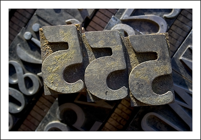
Beautiful light and lovely subtle color pallette. This brings back really nice memories...I used to do some type setting the "old school" way when I was in graduate school doing my printmaking thing...for me it was so very relaxing...it was something you had devote your entire concentration too, just me and my words... plus I just loved playing with the type and thinking about how it had been used previously...thanks for making me smile with this one.
I really like your movable type. The photo is clear and very to look like. I don't believe he needed to expend the effort on the border, but it does not detract from the photo. Keep up the good work!
to my eyes, the main focus point seems to be the flat plate behind the inverted 5s, and not on the inverted 5s themselves. i feel the image would be more effective with more emphasis on the most forefront surfaces, taking advantage of the details on the inverted 5s themselves.
Just as well the challenge wasn't "6"!
Like the textures and the warm lighting... Not sure three are needed, one position off centre to one side might make for a stronger composition.






 Add photograph to your favorites
 Add photographer to your favorites


