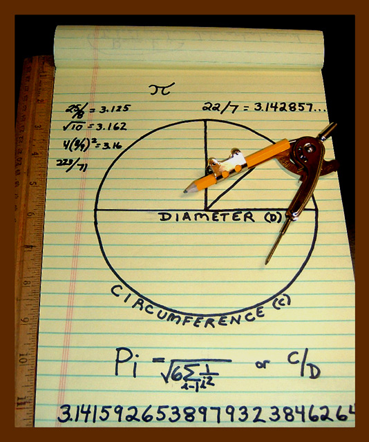
Hi Joy I get to critique you again :-) This was a very good idea for the pi challenge and it is exactly what I had in mind when I first saw the challenge subject. I bought myself a compass and started writing all kinds of formulas on paper and drawing circles etc., but nothing turned out the way I wanted it too.
Composition: Simple and effective. As you've already read in the comments below, the problem here is the border. It is a little too wide, and the color clashes with the rest of the photo, in my opinion this image would have been better without the border completely. The crop is a little too tight, I think cropping out the bottom of the paper pad wasn't necessary as the half cut "4" looks a little strange.
All in all: This is a simple photo which doesn't possess that "wow" effect. The colors are very good and complement each other (excluding the border), the lighting is optimal and everything is in focus.
Not a very attractive photo. The combination of colours here alone is nasty. Black, yellow and brown!! The composition and lighting need a lot of work, and the border is too wide, without anything to separate it from the rest of the image (eg. a thin white border on the inside).
Here I see a fairly straightforward communication of what pi is and its function in calculating circles. To that end, it succeeds. It is a straightforward point of view, straightforward composition and focus, etc. If you want to go beyond the straightforward, perhaps some more mysterious or dramatic lighting may be in order, or perhaps a different perspective could show me even more about pi such as it's "essence" or even "spiritual" nature. Even just putting this in black and white might hint at such things, as color seems to play a very small role here. Good luck!
The picture is nice and sharp, and I like the way you convey pi. For me, the photo would be more balanced if the whole legal pad was in the picture (I'm not sure why you cut off the lower right corner). I would like to see the same photo without the ruler next to the pad, and without the brown frame -- somehow it seems to that it could be a stronger photo without those elements.
Very well put together showing the topic.Maybe not the most interesting photo,but then the subject isn't all that interesting either. You did very well here in a very traditional way. Good job





 Add photograph to your favorites
 Add photographer to your favorites


 Photographer found comment helpful.


