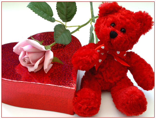
The red teddy is a bit too much for me, it looks a bit, er... 'devilish'.
Technically speaking it's a well composed, balanced shot. Good focus and contrast.
Nicely done. Perfect composition and well focused. The border adds a nice touch. Reminds me of a Hallmark ad. I like the placement of the pink rose to break up the red. The one stem sticking up out of the bear kind of confuses me and doesn't seem to belong there.
Aww how sweet! I like it, the reds come out well on a white background, that's always a safe bet for color contrasts. The flower just adds to the impact, good shot.
This photo shows effective use of color and is very appropriate for the challenge this week. The composition is not bad, but possibly could be made to be more interesting. Something about the bright area in the center of the top of the picture doesn’t work for me. I am not sure if it is just too bright or if it has to do with the lines of the leaves in that region of the image. The other thing that I might change if it were my photo is the lighting. The light appears to be a tad harsh, especially on the lid of the candy box. The specular on the front edge of the box it a bit much for my taste. I also don’t like the way the glittery flecks in the paper of the box are reflecting so much light. I think this picture would have looked very nice using available or natural light. You might be able to construct some simple diffusers for your light sources to improve this as well. I think this is a good effort and I gave it a 5.
I think the red is too dominant, and throws off the balance. IMOH I think just the rose and the bear OR the rose and the heart would look nicer. Nice background choice, great focus and rich color.






 Add photograph to your favorites
 Add photographer to your favorites


 Photographer found comment helpful.


