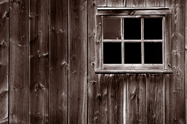
I had 4 very different possible entries for this challenge. This was my favourite, hope you agree.
Using PSCS:
Straighten - Rotate 1.16
Auto Level
Brightness/Contrast - -10/20
Greyscale
Duotone - Black/Pantone 7516C
Burning/Dodging
Cloning done in bottom left pane
USM (225/0.3/0)
Resize
USM (65/0.3/0)
Save for web
Statistics
Place: 15 out of 182 Avg (all users): 6.1378 Avg (commenters): 8.4444 Avg (participants): 5.8438 Avg (non-participants): 6.4200 Views since voting: 1548 Views during voting: 304 Votes: 196 Comments: 10 Favorites: 3 (view)
Great composition!!!! The lines are so perfectly perpendicular and parallel!! Really great job taking your time and seeting this up. The B&W works really well on this shot. I think it shows a lot of detail in the wood that might be lost in color. It also really shows off the window panes that are missing. Wouldn't change a thing!
This looks like JB's work. Too bad there weren't just a few shards of glass left in the empty frames, just to add some edge. Beautiful tones, contrast, and placement balance! :)






 Add photograph to your favorites
 Add photographer to your favorites

 Photographer found comment helpful.


