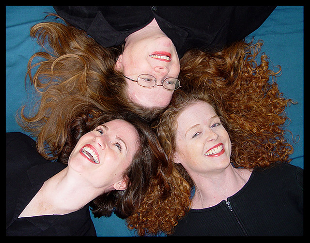
The big mistake of many voters in this challenge was to assume that the brightness of color was predominant over the importance of color. In your image, you show us the importance of color in communicating the differences and similarities among these sisters, as well as the obviously loving bond between them.
The fact that the hair is intertwined suggests that a lot of thought was put into just how they were to be posed. This hair, it seems, represents their personalities--not individually, but as a family. In other words, I understand by looking at this image that the family itself has a personality that these sisters are communicating through their hair, as it were (and as weird as it sounds to say that).
The lighting and point of view are therefore very effective in revealing this truth, and the composition and clarity of the photo engender interest and make it an engaging image to look at.
This image, in terms of color, requires more than a cursory glance. Unfortunately, that is what most folks give images around here.
Capturing people is the hardest thing in photography to me. You seem to have no problem with it: great work, wonderfull compostition and technically perfect to me. Color isn't the first thing coming to my mind though: the three sisters capture my attention, ther looks and smiles.
What a kick in the pants. Refreshing after all of the bright photos I've seen. Here, you show us the IMPORTANCE of color as opposed to its brightness, and the color suggests some kind of bond between the sisters. Well done!
Very interesting take on the challenge. Good photo for a hair product ad. I was noticing the sister models and how their gazes affects the photo. The gal with the curly hair is looking up at the camera where the other two are gazing to another sister. Possibly the curly haired gal should be looking to toward her sister to the right of her, maybe turning her head a little more to the right. Obviously, a white background would wash out their faces, but maybe having a black background would bright out the colors of their hair better than the current teal constrasting color. Get my point? Just being picky...LOL. Actually, it's a well done photo
I like the composition here a lot. The hair color works very well with the blue background making this a very effective entry for the color challenge. The exposure looks good and everything appears to be in sharp focus. There looks to be a bit of a hot spot on the top lady’s forehead but this is a very minor issue. Overall I think this is a good picture and I think it will do well this week. I gave it a 6.
What a great way to take a portrait of Sisters. And what lovely smiles. You show their beautiful smiles, their warm eyes, lovely white teeth, great focus, smooth lighting, you've done a wonderful job of posing them too.







 Add photograph to your favorites
 Add photographer to your favorites


 Photographer found comment helpful.


