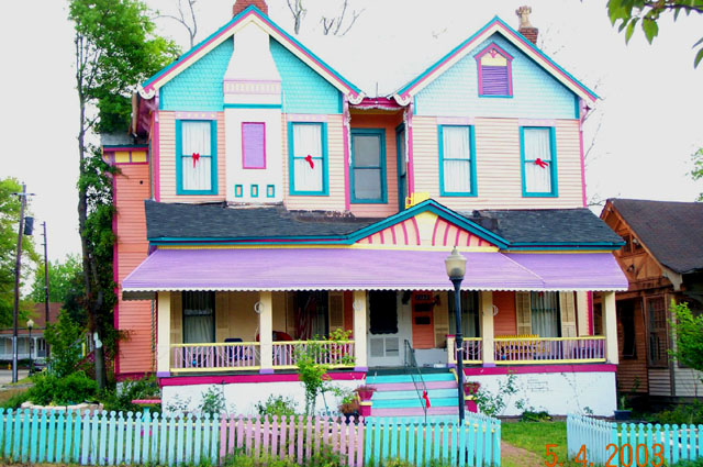
What I like most about this photograph is the subject matter. "Color" is certainly the first thing that comes to mind so you've certainly met the challenge. ("Garish" happens to be the second thing that comes to my mind!) I'm glad you found this subject and that you shared it with us.
Some ways to improve the photograph ... first, as many people have mentioned, try to turn off the date feature of your camera or compose your pictures so that you can eliminate the date when you crop and resize the picture. (I assume that you've got the date format set to European format of day-month-year.) If you have trouble doing this, I'm sure that asking a "how-to" in the forums would quickly find an answer from others who have the same camera.
Next, cut down the exposure some so that the picture, overall, is slightly darker. I think this would have brought the colors out even better and kept some of the areas from being pure white when we should be seeing detail. Although it's hard to say without having been there myself, a vertical format might have worked better in order to include the chimney and to eliminate the distractions to each side of the house. I would also have tried to shoot this straight-on although architectural photography is quite difficult with SLR cameras.
Finally, although it isn't always possible to choose the time of day when we get our best shots, I would have tried this either early morning or late evening. Can't say that it would have improved it but the generally warmer lighting found at those times might have helped.
Looks like you're fairly new to DPChallenge so I'll just add a "Welcome" and I hope to see more photographs from you in the future.
interesting, not my particular taste in house colors, but interesting none-the-less. i think your date is set wrong on your camera. this is only April, not May.
oh, my word! who ever lives here must be a very happy soul! LOL
First tip: turn off the date stamp on your camera. I think most cams can turn that off... see if yours can.... if not.. frame your subject so that you can crop it out.
This picture looks like it came directly out of the camera with no post work. I would have cropped out the rest of the neighborhood as much as I could to have the colorful house fill the whole picture. Then worked on brightness/contrast and sauration to bring out the colors better. The top of the house appears slightly washed out. Also, would be best to turn off the date print on your camera. Very interesting and colorful house. Good subject matter for the challenge.
How would you like to live nextdoor to that? Wow!! You have definitely met the challenge with this photo!! I do have to deduct for the fact that the house is crooked and that you have left a date stamp on it - very unattractive.
I don't know how anyone could paint their house like this! But for you it was a good find, good one!!! The date at the bottom is a little bothersome though - Gary.
There are several problems with this image: it is too bright; the date on the bottom is a big no-no; it should be cropped to show only the house and not the distracting irrelevant background; and the photo should have been taken in front of the stairs so that all horizontal lines of the house are parallel, unless you are trying to achieve a photo with more of a perspective view on the house. Good choice for colour though.
Not a bad image, but the overexposure and especially the date in the lower right catch my attention....did you have the date on purposely? To me it really gets in the way
This is a cool picture, I can’t believe someone painted their house like this! I do, however, find some of the lines to be disturbing. Particularly the way the fence appears to be at a slant with respect to the awning over the patio. It might have been better to crop away the bottom part of the picture to avoid this. The top part of the house and the roof appear to be blown out also which detracts from the photo. If you use a little negative exposure compensation you can prevent this. Slightly underexposing the picture should also bring out the colors more. Compositionally I would rather see the house not smack in the middle of the picture and I would like to see more sky about the house. I find it uncomfortable that the chimney is cut off. Finally, I would strongly recommend turning off the date-stamp function for challenge pictures. This is a very good picture for the challenge and with a little more work it could score very well. As it is now I gave it a 3.
Wow, lots and lots of color in this photograph. composition is good. Certainly meets the challenge. You should remove your date from the photograph though, it spoils it tremendously and in MHO you\'re going to lose points. Lighting is okay, what can you do in natural daylight? Visual impact is interesting to say the least with all the colors and all. Good luck in the Challenge. (when cropping, could you not have cropped off the telphone poles on the left hand side, and you cut off the chimney too close?)






 Add photograph to your favorites
 Add photographer to your favorites


 Photographer found comment helpful.


