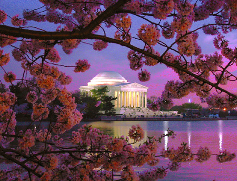
It seems I get to critique all the images this week that are taken close to where I live ... I'm in Northern Virginia. And I'm a big fan of the Cherry Blossoms even though I didn't get to go this year. You captured one of the quintessential images, the framing of the Jefferson Memorial by the cherry blossoms is fantastic. This is one of the images where placing your subject in the center actually works well because the surroundings are so interesting, too. Dusk was also a good time to capture this, the sky and its reflection in the Tidal Basin are mimicking the colors of the blossoms beautifully.
I feel that the image is a little over-saturated, the blossoms are too red, and especially in parts of the sky and the reflection, the colors appear a little blotchy to me as if you only increased saturation for red. I would also like to see a larger photo (you can go up to 640 px on the long side) because that would likely make more detail in the flowers visible. [Edit: I usually only read the comments you get after writing my comments, and I guess I didn't tell you anything new here, sorry.]
Irrespective of that, you took a stunning photo that fit the color challenge really well and was well liked by most of the voters judging by the well-deserved rating you got. If you ever decide to become a member, you should consider making this available as a print, I think it's very sellable.
Welcome to the site, I'm looking forward to seeing many more great submissions from you :)
Please let me know if you have any questions or comments about this review.
NIce framing with the branches. The pink in the sky on the right makes this seem a bit oversaturated or something..too grainy to look like natural sunset.
The monument is well framed by the trees. The sky looks like its pixelating, probably from oversaturating the sky and maybe even the hue change. It would've been a better pic with the darker blue sky. The subject is great.
Very engaging shot! At first glance, it appears perfect; upon closer inspection, it appears the saturation on your red/magenta channel has been increased too much, causing some odd pixelated effects, particularly in the sky.
Striking - caught my attention right away - enough to write you a short "wow, good job" but that doesn't help much. What if the subject were like |--| lower, so that the right edge of the monument were in that blank area and it were JUST barely more centered?
This is a very cool idea and I like the color and composition very much. The way you framed the memorial is very well done. I am wondering if the color was really like that or if it was done in post-processing? Either way the color is very appealing. I am not sure if it is just my monitor but the focus appears to be a little soft out at infinity. Perhaps a narrower aperture might have produced a better result, then again if the aperture is too small you will get a soft image due to diffraction effects which also could have been the case here. To me this is a powerful photograph and I would be proud of it if it were mine. I gave it a 7.





 Add photograph to your favorites
 Add photographer to your favorites


 Photographer found comment helpful.


