Thank you very much for your nice comments. I'm _very_ happy about the placement and the score. Actually I'm surprised that it scored that high, because I thought that the problems with grain and sharpness would ensure me a low score. I'll never understand voting here on DPC ;-)
I have an outtake of the series and personally I like it more than the one I submitted. But eventually I decided that way, because it fits better to the Color theme.
Special thanks to Gary for his great CC critique. I totally agree about the issues you found to "mecker" about ;-)
Oh, and btw.: this was the first time I used a border. After a long time of being sceptical about that, now I think it's a good thing.
Hiya Stephan, well I get to critique your photo. First of all congratulations on an excellent calla shot, (I only found out for the first time last week from John that these flowers are called callas).
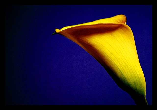
The composition of this pic is very good. I love the way the flower curves in from the right side and flows into the center of the image. The negative space on the left is justified here and it gives the flower breathing room and I think anything less would have given this photo a cramped feeling.
The choice of blue for the background was ideal. Yellow and blue always go well together, you can never go wrong using that combination. The border is not overdone at all and fits in well especially with the added effect of the border disolving into the negative space from the left hand side.
There is a jagged edge on the top petal on the left which is a little disturbing if you look at it long enough, and the background blue is a tad noisy. But these are only "Kleinigkeiten" which don't really lower the quality of this image at all, just that I had to find something to "mecker" about right :-)
Overall and excellent image, one that is a pleasure to look at, and one you should definitely start offering as a print! It has also just jumped on to my favourite photo list.
Simplicity at its best! Great shot and really well lit! Maybe slightly on the soft side which adds to the overall effect (if thats what you were aiming for, it is nice). I'd have liked it a tiny bit sharper, but thats just me! Well done!
absolutely gorgeous! If I could suggest anything at all, it would be to crop out the dark area on the left side of the photo... but I think this is great! a bit of stair stepping from ??oversharpening?? nice work all around.
Nice image and good lighting. I think that the flower would have been better off if it was centered in the middle of the photo more. The negetive space on the left makes the eye take away from the main subject and it is distracting.
Rule of thirds, is it? Well DONE on that front, and nothing is more delicately beautiful than a calla lily. The blue background brings out the colour of the calla perfectly. -10-
very nice work... the color contrast here is excellent. The calla is a beautiful flower and I'm hoping to make some photos of a white calla myself over the weekend. - setzler
100% A+ i found a new favorite. I enjoy everything about this image. The noise underneath the shadow of the pedal is a bit unfortuinate bit this image kicks ass.
Really vibrant Yellow against the background of your choice. Great lighting which allows you to focus to your delight. The visual appeal is excellent and you are to be congratulated. Your use of 3rds is a good choice and shows imagination.






 Add photograph to your favorites
 Add photographer to your favorites


 Photographer found comment helpful.


