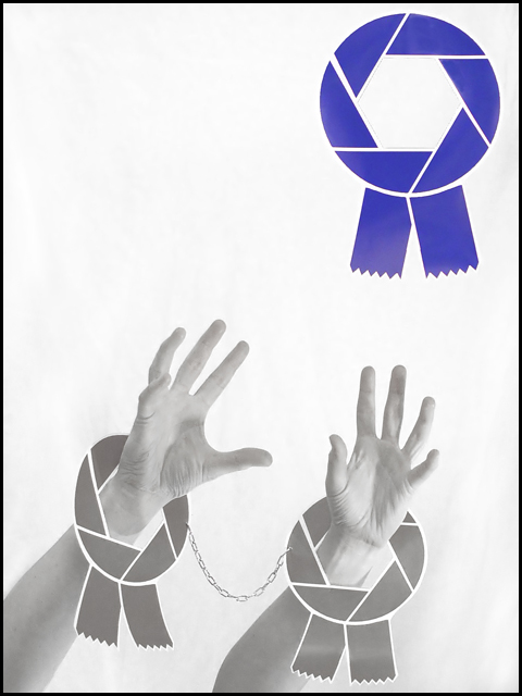
Man this was a nightmate! my "handcuffs" are meant to be brown ribbons, but with the white balance, poor iso past 100, my lame lighting (I use half a lava lamp!) i found it so hard & am really dissapointed as it looks SOOOO much better in my head! Ah well. So my dream is to get a blue... AINT GONNA HAPPEN WITH THIS ONE!!!
Had to use desat, as the arms look really bad with the brown ribbons (made them on paint BTW). Did a bit of dodging to get rid of some creases on the background. Cloned out two threads holding the blue in place, and a bit of my missus's head, who has the patience of a saint!
Statistics
Place: 39 out of 114 Avg (all users): 5.8756 Avg (commenters): 6.8571 Avg (participants): 5.7176 Avg (non-participants): 5.9773 Views since voting: 1099 Views during voting: 484 Votes: 217 Comments: 26 Favorites: 1 (view)
Most images like this blatantly going for a high score generally are not done well. This is an exceptional image deserving of a ribbon! Hope you get it.
the saturated blue draws the attention to it, and not at the more interesting process of reaching out for the blue. there's a lack of contrast here that imho could and should be fixed. it's a nice idea, but the executed image isn't very effective for me.
This is my second go-around =) - Too funny! I can definately relate to this one - haha! The bottom of the blue ribbon looks faded/off color. It's a little distracting. I also wish there was more contrast in the hands/ribbons... you need some dark darks - it's too flat. I still gave it a 8 - great job!
I really like when people make an effort for a composition! I know you meant it to look like a dream but imo would have been better less grey...well done!
LOL, this is a lot like mine, but I like your version better. The gray ribbon hand cuffs are clever, but I think it would have been REALLY funny if they had been brown. I wouldn't be suprised if this places in the top 10 or so.





 Add photograph to your favorites
 Add photographer to your favorites

 Photographer found comment helpful.


