Hey!
Well, that's some color! Challenge met.
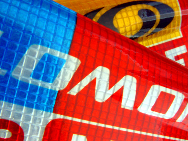
As far as composition goes... I would have no idea what this photo is of without the title. Therefore, it isn't really a good product shot.. it's more of an abstract macro. I do like the diagonals and the layering going on.
Somehow it just seems too bright. Maybe it was overexposed or just really reflective. The focus also seems a little soft (or else it's just the glare making it seem that way).
I find this photo a little hard to look at because the colors are just so "in your face".
I have to agree with the previous comment about it being a decent challenge shot but not necessarily a good photo outside of the challenge. I don't think that it would score very high on photosig or another site that just ranks photos on their merit without a topic.
It's not bad.. I don't have a lot of suggestions... it just doesn't stand out enough to be memorable in 300 shots. |







 Add photograph to your favorites
 Add photographer to your favorites

 Photographer found comment helpful.


