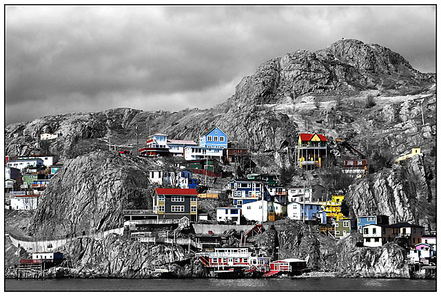
The large version is quite spectacular! I too think the framing could be improved, as both left and right seem cut off in an uncomfortable manner, but otherwise it's just lovely.
This is really great. Love the clarity. I have two suggestions. One, remove the colour from the left side buildings to direct attention to the main ones. Crop the water/ground from the bottom: this would make the shot even more 'magical' by making the buildings appear to be clinging to the mountainside. Ben
Thank you for ur valuable input. Here is editted picture as per your suggestions :)
This is really great. Love the clarity. I have two suggestions. One, remove the colour from the left side buildings to direct attention to the main ones. Crop the water/ground from the bottom: this would make the shot even more 'magical' by making the buildings appear to be clinging to the mountainside. Ben
this photo makes me want to see what farther on the right...i just keep looking for more over there for some reason....hope this helps...i like the selective desaturation...i think i would've started the photo (from the left side) where there is just the rock, i dont think the houses on the left add anything to the photo and i would like to see more of the right side( that pink house looks cut off) this is just my opinion...please take with a grain of salt :o)
Thanks :) Try one of these links to get to the larger view.
Larger View
If this doesn't work, plz check out the last picture in "St. John's" album and click "view full size" link underneath the image.
//community.webshots.com/user/nonagesoul6




 Add photograph to your favorites
 Add photographer to your favorites


 Photographer found comment helpful.


