Wow bear now this is getting waaaay too much! First a ribbon, and then you don't leave the top 10... why don't let the rest of us some space here too???
Just kidding!! Congratulations on your wonderful finish with such a trivial object but photographed in such a beautiful way!
I find it hard to decide which is intrigues me more: your photography or your coocking.
I guessed this was your shot when I voted on it! It had your touch all over it from the "food" subject to the way the shot was laid out. Congrats on the top 10!
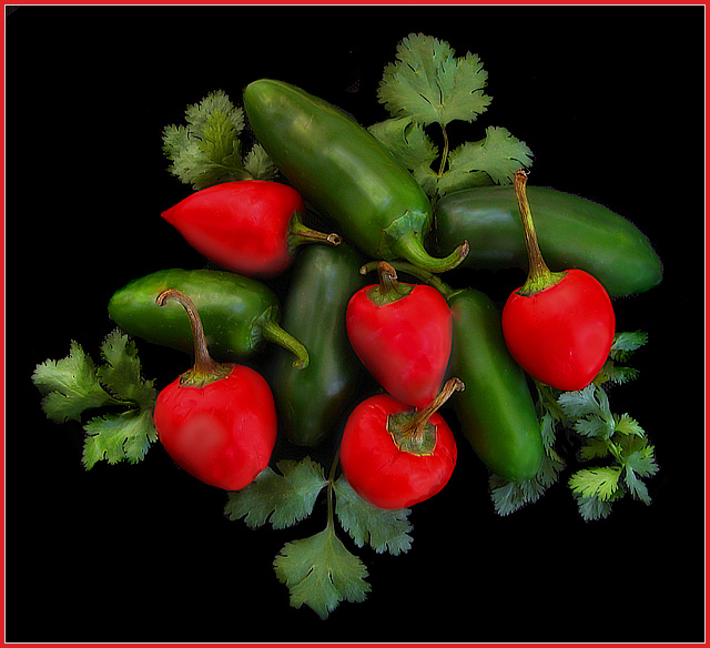
Yup, I use 'em cuz I always have 'em around; used 'em in stock, used 'em in pink, used 'em in dreams (in a supporting role), used 'em in this one :-) But it's LEGITIMATE this time, chiles = Mexican = Cinco de mayo, eh? The cilantro is also a recurring theme... Plus I have shot gralic press, chef's knife, kitchen shears, bowls; so stuff from the kitchen is somethign you get a lot of from me. My north skylight is right over my kitchen island, and everything's right there :-)
Congrats !! I thought it was yours as I remembered one of your entries with chillies.. I think it was for Stock Photo.. and this one just looked like your entry :)
This is a real suprise. I never dreamed 6.3x would make top 10.
For those who commented about the garish or oversaturated reds, I'd agree they ARE garish, but I'd point out the greens are equally hpersaturated. The goal was to make an explosion of color, a "fiesta" feeling if you will.
For those who commented about the "flatness" of the red, you're absolutely correct. The surfaces of the red peppers were not as smooth as they should have been, and they were throwing ugly specular highlights around. I couldn't match the highlights of the firm, green peppers without possibly illegal cloning and brushing, so I just smoothed the reds out in Neat Image. I tried to find better peppers to reshoot, but no luck. I could find smooth LONG red peppers, but I wanted the cherry peppers and this was the best I could find.
Very crisp salad... er... Photo! I like the colors agaist the black background. I don't care much for the border, but not deducting any for that. Good job.
Beautiful colors and arrangement. My only suggestion for improvement is a little more light. I know you don't want hot spots from the lighting, but a little "shine" adds depth. That seems to be the only thing missing in this beautiful image!






 Add photograph to your favorites
 Add photographer to your favorites

 Photographer found comment helpful.


