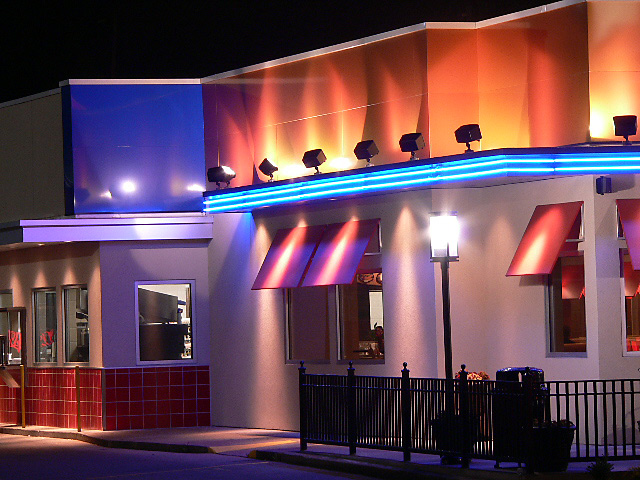
Great colours and good exposure. Given there is no sense of pattern I think it could have been enhanced by a clear subject. I know it was probably unavoidable, but I do find the bright light distracting in such a prominant postion in the frame - but nevertheless you have achieved a good result. Well done.
very neat colours, i wouldve rated it higher if the angle was different... instead of two buildings almost going straight across, maybe a whole line of buildings zooming out and an angle
This is an ambicious image, congradulations. As with all old buildings, over time they settle to where no two angles are the same. You just have to choose 1 that works best. In This case the choice I would make is the corner where the blue and orange facades meet because of its strengthe. The building as it is, is heavily weighted to the left of the image so it appears to be listing. Just by rotating the image a tiny bit, it will regain its balance. The rest of the composition is very good. I really like the ambiance.
Well, this sure does stand out by its vibrant and splendid colors. Great subject and composition - both very appealing- The only thing I have to point out is that it seems to me it needs a slighlty rotation to the right. Otherwise, very well done.
I like this, it could almost have been painted - well spotted! Avery crisp image with superb colouring and an interesting composition.
Bumping up to 10!







 Add photograph to your favorites
 Add photographer to your favorites


 Photographer found comment helpful.


