Author Thread Comments Made During the Challenge
Post actions
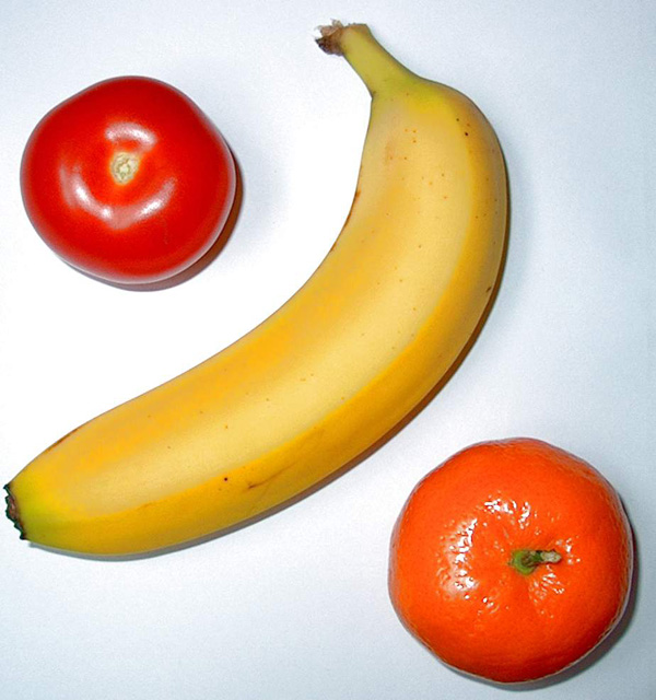
Would increase margin to left of the banana by two mm :-).
Post actions
Simple but effective, good one!
Post actions
Percent sign -- clever! Wonder how many people will get it?
Post actions
Interesting take on the challenge. Good idea
Post actions
nice. I think the shadows are a little too hard. I like the separation of colors
Post actions
Took me a 2nd glance to realize the "%" symbol. Clever.
Post actions
Post actions
Post actions
good choice of fruice and veggies, good lighting, focus is right on; good cropping, great idea for the challenge
Post actions
The shadows really pull away from this image
Post actions
kind of blurry, but nice idea
Post actions
VERY bright lighting, but great colors. Looks saturated or color changed towards red, though.
Post actions
Are you certain that shouldn't be color? Without the "u" :-) Seriously, now... I'm not certain whether it is simply the lighting, or what, but this shot seems a bit too two-dimensional to me. The fruit just doesnt't seem to 'pop' out of the photo. Perhaps a softer (maybe fluorescent, no flash) lighting might help you capture some additional depth and dimension, while also eliminating the individual shadows.
Post actions
I would have liked some brown spots on the bananna.
Post actions
Post actions
Cute title. THe light is harsh and caused too much glare. Other then that, fine job.
Post actions
Simple and colorful. Like the diagonal here





 Add photograph to your favorites
 Add photographer to your favorites


 Photographer found comment helpful.


