Hi Mona. First up congratulations on such an original idea which you pulled off well. I didn't know what a Dala horse was so I just learned a little about these horses and Lindsborg on the internet, quite interesting.
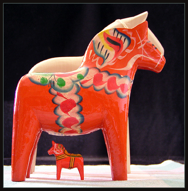
I love this orange color which dominates here, especially highlighted on a black background. The detail in the horses is amazing and the composition also bang on.
The lighting coming in from the left seems to be a little too harsh which can be noticed on the horse's hind legs and neck where it is blown out some. A diffuser on your lighting may have avoided this unwanted effect. My only other niggles are the white horse in the background, I would have removed it from the image completely, and the cloth at the bottom doesn't really fit to the pic.
Otherwise a very good submission which should have ranked higher than it did. Well done Mona.
I like the color and composition of this photo. I think the light is a bit bright and the colors are a bit washed out from overexposure (the blacks don't look black) - otherwise good shot.
Picture seems kind of flat. Doesn't really do the colors justice. Perhaps adjusting the contrast and saturation would help the colors stand out and look more vivid. Plus, I would have like to see the black background extend down to include the surface. The stark transition to white takes away from the horses. Otherwise, the artwork on the horses is fantastic and colorful.
Nice colors. Not too sure on the focus, seems a little soft. I would like to see the lighting down a little bit, and them in a more natural looking setting (on a shelf or dresser, or something like that), because the background doesn't highlight them well
Very nice work. I do think though you could have made it just a little more centered. All in all your imagenation is great I like your style. Keep up the good work.
Dalarna. Got eight of those myself.
Handcrafted by John Gudmunds in Rättvik. Nice stuff.
The colors look okish, a little bit washed out. The blank one in the back distracts a bit. I would have taken it away or positioned it in a way so that it would add more to the scene. The main 'problem' here is the background. The black in the upper part works, but the light black and brillianty lit cloth underneath don't do the image justice.
Hej! Cool. I have a red and a blue. Putting the sizes together like this really helps the composition. The lighting could be a little softer - did you diffuse it with something? The focus also seems a tad soft, and I think you could've just left the third one out of the shot since it doesn't really show and isn't colorful anyway.






 Add photograph to your favorites
 Add photographer to your favorites

 Photographer found comment helpful.


