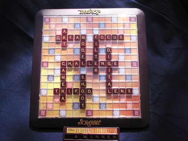
This is a good shot! Only problems I can see are that it seems to be too much light at the top, and your backdrop cloth should be smooth, try to iron it out a little. I like the way you have set up the game board
Nice choice of words, very appropriate for this challenge. The letters on the tab are a little dark, and there is a hotspot in the top right of the board. I possible, I would try to shoot something like this with natural light, and see if that gets rid of it.
Nice photo - the words are well chosen and laid out clearly - it made me read each word. Perhaps the lighting is a bit harsh at the top of the board and a little dark on the "a winner" rack. A small amount of fill lighting would have helped there.
A nice shot, but would be much better if the wrinkles in the backdrop were removed, maybe do some heavy softening in photoshop. There are also some bad blowouts in the rear, especially toward the right side.
"A WINNER"......subtle :) I like this very much, with the top of the board was just as clear as the bottom though - to bright I think, not sure. good job.
Pretty nice product shot... Don't like how the tile holder is right on the bottom edge of the pic though... Should have left some space.. Lighting is a bit harsh up top.





 Add photograph to your favorites
 Add photographer to your favorites


