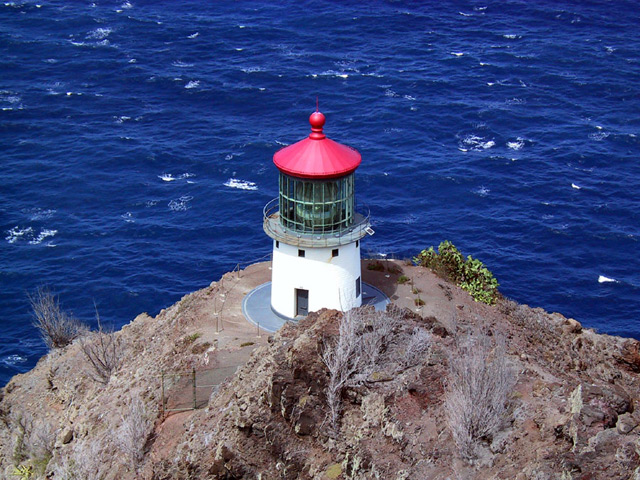
One of my top five this week. I love the blue and the lighthouse roof is excellent. I wonder how this would have looked with the lighthouse off to the right?
Rule of thirds. Never (ok almost never) in the center. The sharp colors of the lighthouse might have been even more dramatic with more blue contrast and less rock .
Wow!! I love the majestic blue color of the water. Nicely protrayed. The lighthouse and the scrubby landscape provide a good contrast. Nicely done. I'll be coming back to see where this is.
The colors here are fantistic. If there was one little thing I would change, it would be the composition. Normally a centrally located subject is not as powerful as one that is located toward the edges. Very well done, never the less.
the blue of the water is breathtaking, especially with the lighthouse roof against it.
If you cropped out more of the rock, and left the lighthouse looking like it was almost adrift in the water (crop to the base of the lighthouse essentially) I think it comes out to be an even more dramatic shot.
Great saturated colors.. Subject is very centered though.. May have been nicer a bit offset, and maybe with *slightly* less of the not-so-colorful hill 7
Beautiful scene. Did you use a polarizing filter or adjust the color in post processing, caus that blue really stands out. I like the central framing, but wonder how it might look with the lighthouse in the right or left thirds of the frame. One of my favorites this round, nice work.
Beautiful pink roof on the lighthouse, great blue waters, a really nice photograph. Really looks barren, doesn't it? Visual impact is quite strong when first looking at it, focus is good, and like I've already said, the colours are really nice. Good choice for the Challenge






 Add photograph to your favorites
 Add photographer to your favorites


