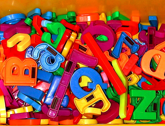
Indoor lighting? Reflection on the plastic letters is distracting. Use of a diffuser of some sort (for example, putting a white sheet between the light source and the box of letters) would help to reduce the reflections. Also, there are too many colours in this photo, which makes the photo seem too busy.
Interesting. I think it would look better in all the letters (or at least the top ones) where face up. There seems to be a more red on top too, than a mix of colors.
I like the idea for this picture but there are a few things that are taking away from an otherwise strong photograph. I would have liked it better if none of the letters were flipped over and if the light was softer. These two problems are easy enough to fix. To make the light softer you can place a piece of tissue over the flash to diffuse the light some. You could also try it outdoors in natural light. I think you might have left some upside down so we can see that they are magnets but for me I would like tem all to be right-side-up. The other thing that seems to be detracting from this photo is the cropping. I would have completely cropped away the drawer so it is only letters. I think that with a little more work here this one could be a prize winner. The way it is now I give it a 4.
creative subject choice. Try to be more creative with your technique also. It looks like you used the flash as the primary source of light. Try to use a soft, external light source. Even a lamp with a shade is better than the camera's flash usually. Also, experiment with your angle, depth of field, etc. Force yourself to take (for instance) 25+ pictures. It forces you to keep looking at your subjkect in different ways and think of different things to try. Good luck :-)






 Add photograph to your favorites
 Add photographer to your favorites


 Photographer found comment helpful.


