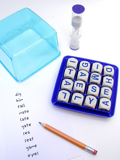
Took over 100 photos of this image over 3 days. Fixing the letters, adjusting the pencil length, making new word lists. Insane, I would have NEVER taken this picture if it wern't for DPChallenge. Adjusted size, hue/saturation, and sharpened.
Statistics
Place: 25 out of 94 Avg (all users): 5.8358 Avg (commenters): 6.9259 Avg (participants): 6.1481 Avg (non-participants): 5.6349 Views since voting: 1521 Votes: 207 Comments: 29 Favorites: 1 (view)
digit, metal, easy, games, tally, gates, sell... Go for those big words! 12 extra points for you!! Just kidding. Cool picture, fun game. I like the plain composition and the starkness of this picture. Good job.
Clean, well photographed..best of the board game set shots for me this week. I am guessing you have a nice light set or you really can work the table lamps to great effect to get such even lighting :-)
Very fine. Great colors and composition. Slight oversharpening shows in the lettering and around the edges of the cubes, and the lighitng isn't quite even (falls off at the bottom and in the ULHC), but these are minor issues. You did see "digitally, right?
I found a nine letter word, which might be a subliminal message. Good lay out and idea. White balance might be improved due to the overbearing blue tones.
This really appeals to the graphic designer in me. I love the subtle use of color, the sharpness and clarity of the game and words...it would make an excellent product shot for Boggle as well. Good job.
I like your choice of lighting for this photo. It compliments the colors quite well. I probably would have tightend the composition up some, but that may have ruined the clean crisp look. Good job.
I'm guessing the inclusion of the word "digitally" was intentional? This is a beautiful image... my only complaint, a very minor one, is that the white-balance seems just off.
This seems a little sterile. I think a different base color would have been useful to differentiate from the paper. Also, I appreciate why you might want to use a freshly sharpened pencil, but if all those words have already been written, wouldn't it be not quite so sharp? In fact, it may be the words themselves that make me think of this as sterile. If I'm playing a timed game like this, my own writing is nowhere near that neat and tidy. This all makes it sound worse than I really think it is. Good work.
This is a good photo but it makes me want to put my sunglasses on :) This would have also been a good entry in the advertisement challenge two weeks ago.
(Peggy Hill could have gotten WAY more words!) Nice lighting and the composition is really balanced. I especially like the extreme point on the pencil!
Brilliance focus and lighting. Making the words easy to read helps people absorb the image (they don't become distracted trying to work them out) Choosing a portrait layout was interesting. If I was selling Boggle in a magazine I would seriously consider this image - well done!






 Add photograph to your favorites
 Add photographer to your favorites


