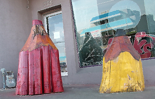
I find the mosaic / cubist processing done on this image distracting. It seems to highlight the lines in the background, drawing attention away from the pencils. This might have looked better in B&W, which would have highlighted the textures of your subject.
The lines in the window and door all look a little weird. I assume it's due to a filter having been applied.The 'pencils' look unaffected and the overall effect is a bit strange. Perhaps if the filter (if indeed it was) were to have been applied a bit more strongly, it wouldn't look so strange.







 Add photograph to your favorites
 Add photographer to your favorites


 Photographer found comment helpful.


