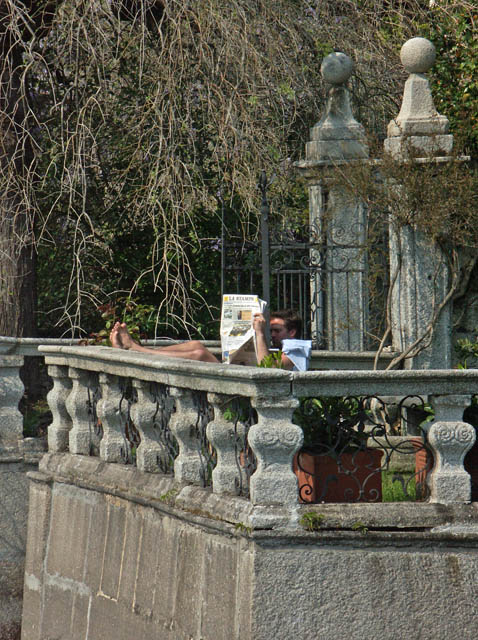
The white thing in foreground, below his ear is quite distracting. It could have used a tighter crop perhaps. Lovely stonework/setting. Nice contrast of old and new!
Subject is not sharp, too many textures make point of focus uncertain and composition is unimaginative, centered subjects usually don't work too well. Shadow across face is not good.
Either a tighter crop or taken from a different angle would of scored this higher for me. The colors are a little flat and there is a lot going on with the branches, pots, wall and fence. However all that being said it's on target for the challenge.






 Add photograph to your favorites
 Add photographer to your favorites


