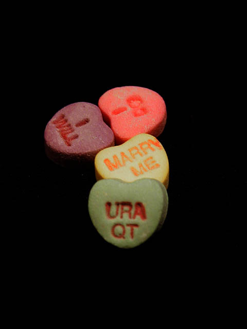
Needs a sharper focus and a different crop. Especially the "ura qt" being somewhat blurry creates problems for the shot. Also the empty space at the top, bottom, and right side don't seem to serve a function, so a tighter crop would probably be prefered if you wanted to leave your subject centered. I like the "path" idea that you used, but this needs a little cleaner execution.
Even thought it is not in color, I like the jet black background for this image. The hearts are not quite as "colorful" as I would like for this Challenge but the arrangement is great. I would prefer the closest heart to be in better focus.
cute idea. needs better focus. having it centered with so much black around it is not a great impact. I think it would be more interesting off toward the lower left cormer,. or right.
Interesting approach to the subject; I like the very dark background in contrast to the brighter colors. In my opinion, I think the green candy heart should also have been in sharper focus. Quite nicely done!








 Add photograph to your favorites
 Add photographer to your favorites


 Photographer found comment helpful.


