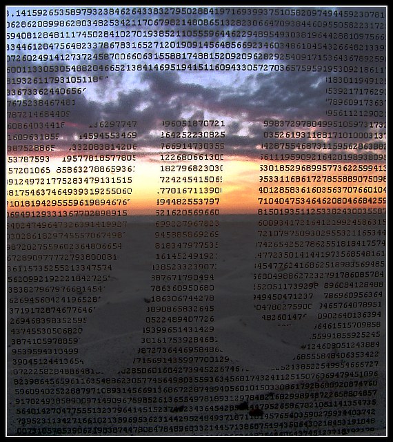
I printed the design on a transparency and clipped it to a pane of glass, then stood it up in the sand on the beach and shot the sunset through it. Lots of processing to bring out the colours without losing the numbers.
Statistics
Place: 10 out of 76 Avg (all users): 6.1727 Avg (commenters): 7.1111 Avg (participants): 6.2667 Avg (non-participants): 6.0600 Views since voting: 2637 Votes: 110 Comments: 26 Favorites: 3 (view)
My only critique is in the execution, regarding the visibility of the numbers/pi. If the overall exposure might have been brighter, especially in the sand, we coulda seen those numbers better. Or if you had tilted the shot up, or moved closer to the water, you could have included more sky and only 1/3 sand instead of 2/3. Perhaps shrinking the pi symbol down, leaving more surrounding numbers, would have framed it centered in the brightest part of the scene, where it would have demanded more attention.... otherwise awesome!
Fits The Challenge-Yes
Composition-Good
Background-Really nice.
My Opinion-Yes, a lot of processing for this shot. Your extra effort not only paid off here but it shows. Only two negative points to make: The very top is not straight, and the space at the bottom. I do love negative space in shots, but don't think it adds here. The colors are great. The idea unique and so special for the challenge. Good work.
Thanks for all the comments! I know the photo has its faults, in aligning the numbers, etc. However, the transparency was clipped to some glass, which I stood up in the sand, and then I hollowed out a space for my camera in front of it (put a towel down to keep it safe :)). Because of this, I couldn't see the LCD screen at all, so it took a lot of trial and error just to get it this well aligned!
If I'd had time to reshoot, maybe it would have turned out better.
Good idea well-executed. The only thing I'd have done differently is to have the numbers "run around" the Pi-figure cutout, instead of obliterating some of the numbers. But I have access to software that would make that easier...
Technically though, I think Pi is an irrational, but not a transcendental number...
I like the idea of this photo.. I think it woudl be stronger with the background having more sky and less ground, which would highlight your 'pi' symbol with a lot more strength.. nice work :) - setzler
I like this a lot. it would be a little better if you had gotten whatever you used for the pi aligned better - the 3 is chopped off and there is some space at the bottom that isn't covered. otherwise excellent
Very nice imagery going on here. I've got to tell you: the first thing I looked for was the 3.14... at the upper left. I felt just a tiny bit disappointed that the three was almost not there. This image reminds me of Math, Life, the Universe and Everything, so it goes on my high scores list. Thanks!
In some places, the shape is very obvious - not so obvious in others. I love the design and I almost did a transparency as well - glad I didn't. Great background for it but your numbers are trailing away at the bottom - if they were all the way out to the sides, it would show more pi than this does. 9.





 Add photograph to your favorites
 Add photographer to your favorites


 Photographer found comment helpful.


