FIRST IMPRESSION:
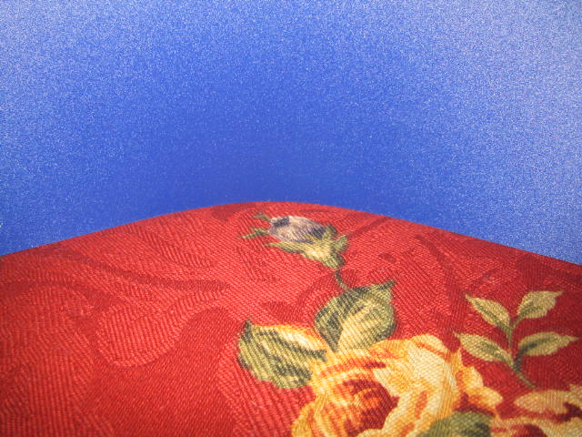
Very bright multicolored picture which works great for the color challenge.
COMPOSITION:
The cropping is very different for this type of shot. It allows the blue to show through, but I think a flat crop of just the fabric texture would have been more itneresting.
TECHNICAL:
The focus is right on which allows the texture of the fabric to add to the shot.
OVERALL:
I think the dominant color of blue takes away from the colorful bottom of this shot. Maybe a tighter crop would draw more attention to it. Also the blue seems to have some noise from the camera. A filter like despeckle of remove noise would have fixed this nicely. Slightly changing the subject or how the colors were portrayed could have improved this great shot for the color challenge.
This is an interesting idea, but it doesn't quite work as titled. The red hill and roses do fit, but the sky looks like a poorly spray painted wall (I suspect a photo manip here - totally legal one, but didn't quite work). Nice photo of the pillow. 6 Swash
I am not sure exactly what this is I am looking at but that doesn’t really matter. You have a nice use of color here. It looks like a throw pillow but I can’t figure out what the blue is. I don’t really care for the white spots on the blue. The pillow looks like it might stand to be in a bit sharper focus. There really isn’t a lot here to hold my attention. I gave it a 4.





 Add photograph to your favorites
 Add photographer to your favorites

 Photographer found comment helpful.


