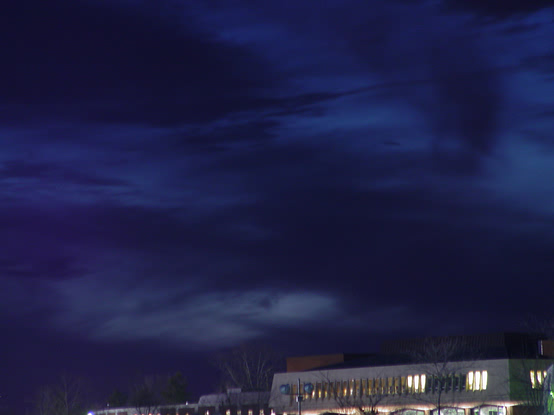
Oddly enough this picture is completely level. The place I took the picture looks out into a college campus that resides mostly on steep hills. Thus the parking lot in where I took it made the buildings look askew. There was a different picture that I was thinking about using that had more of a yellow sky due to dusk. If the oprotunity arises I will post it in another challenge and see what you all think. Thanks all for the great comments they really help a lot. I am a fledgling photographer so I haven't completely developed my eye for really outstanding composition as of yet.
This would've been better if the building was not there at all. Or if the building was actually true to the horizon and the whole thing was included and not just a piece of it.
Great shot of the sky. But I don't like the inclusion of the building - its messy, blury, and gives a crooked line to the bottom of the photo. Perhaps a Tree-top Line would have been better.
Nice rich blue color in the top third of the photo - but....what's the shot of exactly? Just the sky when it's dark blue? I like the color - what if you'd had something in the frame - a single tree, a closer building, a car, anything - to provide some foreground?
I'm sorry but I just don't feel this meets the subject challenge. If the building was cropped out and the sky lightened with a photo editor it would make a much nicer picture.
I like the color in this picture. This one is a pretty tough one to pull off because there isn’t a lot going on to keep the viewer’s attention but the lighting makes the picture. The thing that weakens the picture for me the most is the small amount of the lower windows that are showing at the bottom right side of the frame. The thing that really makes me like this picture is the play of color between the yellow light in the upper windows with the gray of the roof and the deep blue of the sky. I would definitely crop some off the bottom and maybe rotate the picture some to get the top of the roof parallel to the bottom of the frame. I like this picture because of the color and lighting so I gave it a 5.




 Add photograph to your favorites
 Add photographer to your favorites


 Photographer found comment helpful.


