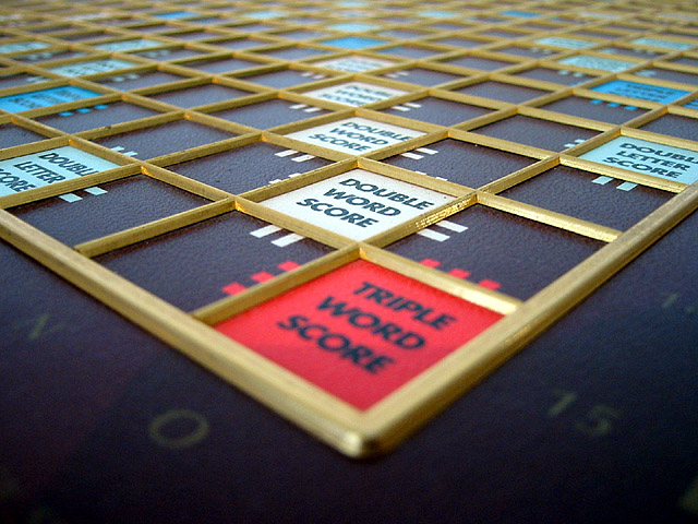
Cool idea! This photo has great potential! I already love the angle, but to me, the red triple word score stands out the most. I might have pulled the lighting towards the front to accentuate the red square, then focused on it and let the rest fade into the shadow. Um, I guess this really isn't helpful criticism, since it is just my opinion! Still, high marks for you!
I really like this one. There were some comments in the forums about the DOF and the near corner being out of focus, but that actually works for me... I think it helps draw the viewer in to the board.
I like the angle you've found here, but would prefer the Triple word score to be in focus. That corner is where all the lines in your picture lead, but the focus and therefore subject of the photo is on the double word score above it.
This is really good. Had I done this, this would have been the angle I would try to do. I wish there was less shadow in the triple word score area but I like it. good job.
The repeating pattern in this is great. I would have prefered if you brought that point down till it was almost touching the bottom frame and then you made the "Triple Word Score" square in focus and then let the rest behind drown out.
I like the perspective, lines, and symmetry in this photo. I generally do not like sections of the 'foreground' of a photo being out of focus (personal preference). Phototgraphs taken as a macro at a low angle are quite difficult to bring into focus throughout the entire frame. Sometimes, it's purely impossible. In this photo, since the 'triple word score' is red and stands out from the others, I would have preferred it being in sharper focus.






 Add photograph to your favorites
 Add photographer to your favorites


