There's not much to say here other than emphasize the other comments already made. You got a really good score with this and people gave you excellent advice so that you'll get an awesome score if you shoot it again. (This should be saves as an example of how DPC really works well for people!)
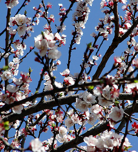
First off, the most distracting thing is the blur being in the front and not the back. I would say that you should use a very large DOF and get everything in focuse here; it would look better against the perfect blue sky in my opinion than a tighter DOF focused on one area. Which brings me to the next problem, the lack of a strong center subject that draws the eye. If you had a large DOF I don't think it would be necessary in a shot like this, but if you decided to go with a smaller DOF, or the one you chose, it is important to choose an area. This is difficult with the busy composition you've chosen. It might have been better to shoot from an angle, crop, etc, to find an area where all the tree limbs were going in one direction.
Overall, a quality photo of a beautiful subject that you could easily get a lot of nice pictures from. It would be cool to do a "study" of many pictures on the tree, including some macros of individual blossoms and a shot of the entire tree. What a nice find!
Very nice colours and composition. Too bad the clump of out-of-focus flowers in the upper left draw the eye away from the rest of the shot. Good job, however.
Beautiful picture, but I'm not sure that "coors" is the first thing I think of when I see it. Still, it's a better picture than anything I've ever taken.
Spring is wonderful. IMO you have tried to capture a portion of it but your picture has some flaws. Try to avoid making a picture with numerous lines going in all directions and be sure you have a main topic that is in crystal clear focus.
Beautiful color BUT ! the blurr should be in the back ground and not up front, try to reverse you shooting and let the back flowers blurr, but the front should always be clear. Keep up the good work cause you got it, it just needs fine tuning and your on your way.
Very nice color overall; I like the use of the cloudless blue sky as a backdrop. (Not sure your colour is the same as my color, though... :) JK!
I would have preferred either a very definite use of a shallow DOF (with a very clearly recognizable subject), or a broad DOF with all blossoms in focus. Just my opinions, though!
A nice and smooth red/blue contrast, and the white works very well in it too. The green is a bit distracting though, and I think that can be fixed with simply desaturating the green color channel, although I'm not sure. This trick was discussed in the forums recently.







 Add photograph to your favorites
 Add photographer to your favorites

 Photographer found comment helpful.


