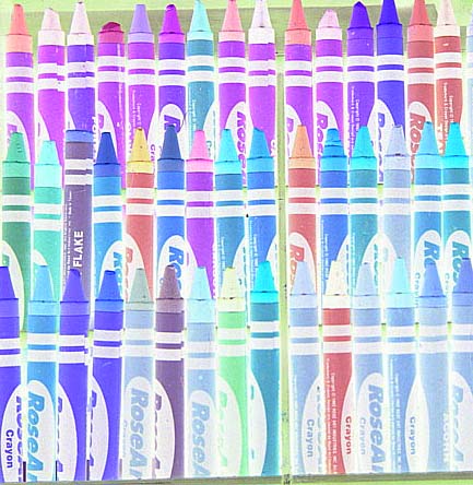
I must say, the upsidedown "flake" crayon is a wonderful touch, but the colors here just don't seem appealing.. it's all too bright for my tastes. Perhaps reducing the brightness a bunch on this shot would work well. 5
This wouldn't be bad except for that line at the bottom of the frame that really takes a lot of steam out of this pic. It shows that this picture is not true to the horizontal where without it, I'd never even check.
You've dared to be different and you've brought out some different colors by doing so. visual impact by doing so is challenging and exceptional, your overall photograph shows some originality and creativenss, so good for you.
This is a great idea. The crayons in negative(I guess) look great. I don't like the one out of place. I mean I get the whole idea, with dare to be different. I think it would have been more noticable if the crayons had never been used. I do like this picture though. :)





 Add photograph to your favorites
 Add photographer to your favorites


 Photographer found comment helpful.


