I'm not sure what I can add that the 59 comments here already have not said.
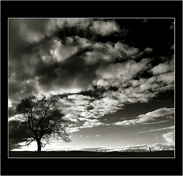
This is a beautiful image. I am not so sure that it is minimalistic though. The whole frame is filled with interesting things to look at. The sky, the tree, the fence, and even the silhouetted ground. All of it combines together to make a reall nice image, but just not 'simple' enough for minimalism.
I love the silhouettes. They look really nice against that background. One thing that my eyes keep going back to is the light area in the lower left of the photo. I'm not sure exactly why, but that section bugs me a bit. I think it just seems like an odd place to be bright. It's drawing my attention to the bottom of the tree and that just seems like an odd place to want to draw attention too.
Focus and clarity look to be really good. Nothing is terribly blurry or soft.
Overall the image is very nice. Border is kind of huge, but doesn't distract from the image in my opinion cause it's black and white.
~Heather~
I also like the frame and I think it adds a lot to the photo's dramatic feeling.
But even without the frame, the photo itself is just wonderful!
Congratulations on your high finish.
I agree with you,artvet, the frame looks great with this photo. And while the sky and tree are both great, what I like best about your photo is... the fence! Great shot, congrats on your high finish.
I like the border except for the last white line, it's just a little bit too much. Remember that every photo on DPC is given a default tiny black border
it's hard to try to decide on what I think is the best in this competition, but maybe this is it.
the tree seems insignificant in view of the immense sky.
its a cool photo, though I think the tonal range is a bit off.
I would try messing around with the levels slider.
The border does nothing for me or for this image. I just wanted to say this, I think the only time borders work are when you want to put a digital signature with the photo. I dont take off for borders, I just wanted to state my feelings.
Without the border this would have been a 10. Unfortunately I find the border to be very distracting. Do love the photo though. Nice use of black and white
Bump to 10... Great photo, I hope this is up there at the end, I think it is much better than an just insect or flower isolated against a large white/black posterboard...
IMHO the subject of this shot is the sky. The sky takes up almost as much area as your border. The tree is not a strong point in your image. If it wasn't for your title, I might not have noticed it. This is an awesome image in spite of the big uneven border, but I can't vote it that high in this challenge...
TC
As much as I love this photo, I have to say that I think it fails in the "minimalism" sense because the clouds in the sky and the light coming from behind the tree and the fence are all such prominent parts of the scene. The whole thing is superbly composed and captured. Good job.





 Add photograph to your favorites
 Add photographer to your favorites

 Photographer found comment helpful.


