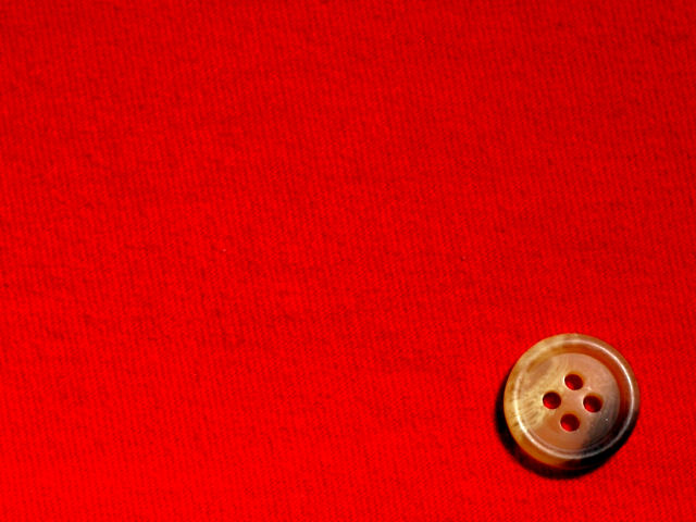
A button on a Teeshirt..
Found it very hard to interpret minimalism properly..But decided to go with minimum shapes and colors as the deciding factors.
Statistics
Place: 275 out of 492 Avg (all users): 5.0975 Avg (commenters): 5.9375 Avg (participants): 5.0000 Avg (non-participants): 5.2121 Views since voting: 1011 Views during voting: 454 Votes: 359 Comments: 17 Favorites: 0
Very nice, simple composition. I like that I can see the red through the holes in the button. The red is a little blown out on the lower left. I'm curious if you experimented with different directions for the weave of the fabric. This is not as pleasing as it could be since it's not really diagonal or vertical.
Nice color and texture on the button, and the texture in the background keeps it from being too tedious. I wish you had chosen a color less bright, though, as looking at all that bright red is hurting my eyes. If you had done this on forest green, it might have been a 9. As it is, 7.







 Add photograph to your favorites
 Add photographer to your favorites


 Photographer found comment helpful.


