My last critique was a pie photo as well but this one is executed much better. As I told the last person I personally do not like these types of plays on words.
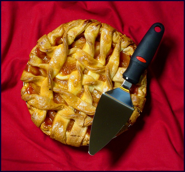
This pie looks very tasty and I like the addition of the server (whatever you call it). The red colors also makes it stand out and look even more inviting.
The composition is fine but safe. It is pretty easy to just take an overhead shot of a pie and have it look pretty good compositionally but it is also somewhat boring and overdone. There must be other cmaera angles that would look very interesting and fresh. Shooting from the side, from an angle, up close with a shallow depth of field, or any number of other ways could be effective.
Everything else is pretty good. Nice colors, well executed with good clarity and focus, effective cropping, and even a simple and tasteful border. So even though I think it is a bit of a cop out to use pie instead of Pi I still think you did a pretty good job with this photo.
A lot of these pie shots are taken from directily above, with a background that doesn't really complement the photo. I find them dull and not aesthetically pleasing. It fits the challenge in a tangential way, but its artistic values just aren't there.
The only pie shot that is decent. Nice set up and the addition of the pie server makes this a little more interesting to look at. I like the red background as well.
Pretty shot. Love the crust....nice light. Not crazy for the red drape or the slicer here. Still you did well, way to go. P.S. extra points because that pie looks soo good!!
nice color, good pi lifter with some color on it, good apple Pi too, looks delicious too, so why tease us, get it cut up and email us a piece will you?
nice lighting, good focus too, nice dof, really good color to the Pie.





 Add photograph to your favorites
 Add photographer to your favorites

 Photographer found comment helpful.


