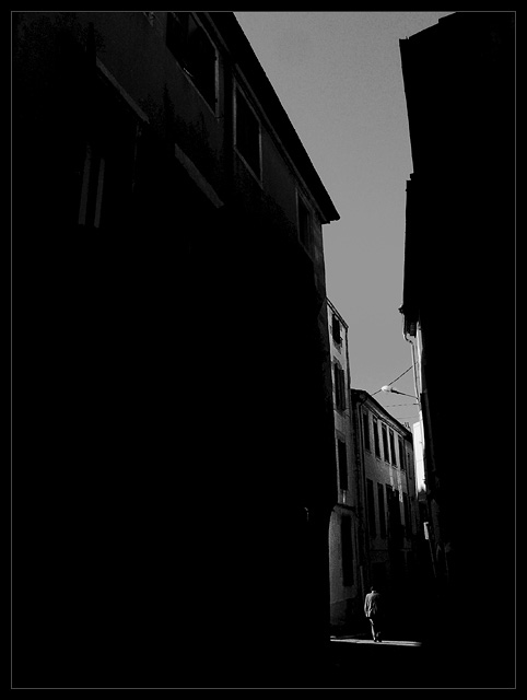
BAM! What impact, what great composition. I really love this image. If Ihad my way, this would be top-5!! Black border is a little too much, maybe only the gray line w/photo to edge?
amazing! i love this shot. will i think the crop is fitting for the challenge I think a closer crop would give a really stronger image. my crop suggestion would be to get rid of the upper 1/3 and the left 1/4
Lots of darkness, and the man standing (walking) in the little spot of light create a great mistery in this photograph. I do not understand however, how this could be sent in for a minimalism challenge, but this is a great foto.
Excellent lighting and isolation of your subject. Dramatic composition which fits this challenge very well. Nice clean processing, sharp, and detailed. 9
I really like the lighting in this photo. How excellently timed to have the subject walking through at just the right moment! I love the shadows of the buildings and the feel that these give to the picture. Great job!
Fantabulous!!! This is such a great shot, there are so many beautiful aspects to it. I lov ehow there is just a small bit of detail in the space taking up the left part of the photograph; just enough to add a little interest. I love how the man is just happening upon a pool of light, and if not at the right time, with the right person, this photography would have been uninteresting. After scrutinizing this shot, I find the one electric lamp sticking out slightly distracting. This shot is the epitome of timing in conjunction with artistic ability and technicality. I have much to learn from you.
I am especially fond of these type of narrow streets as well, theres a coziness about them which is hard to describe.. Memories of new baked bread perhaps. I first got the feeling that this was taken in the morning, but it may be during the day as well.
Just a thought (nitpick sort of)... The shadow on the house on the left side seem a little harsh (the light moves from bright to dark too quickly), it is not bright enough either to make out much detail, I think it might be better if it was either completely black, or brighter. Otherwise.. Really nice work :)
This is an amazing take on the “minimalism” theme. The man in the picture is dwarfed by the tall buildings. The light from the alley is just right and the shadows are perfect to bring all the attention to the subject. 10
I like this a lot. Perhaps would have considered cropping more off the top, but then you would have lost some of the sense of hight which is an appealing factor. Well done - one of the better entries I have come across so far.
I like this a lot: the vertical lines and shadows are interesting; yet the whole image is revolving around the man stepping briefly into the sunlight..it's very well thought out and composed...9
Far from a 'minimalist' sense, but what a fine photo!
The white's white and the black's black. Yet, on my monitor, some 3/4- (in the expanse of the lower wall on the left of the image) and midtones (sky) have turned quite solid. There appears to be also a slight (and correctable) perspective tilt (of the buildings) to the left.
All in all, the image itself does not exactly inspire such hair-splitting criticisms. It still strikes me as an excellent black and white, a marvellous photo, which when I squint a little reveals a strong composition as an abstract space.
I think this is one of the best in the challange but I am partial to B&W. Most voters seem not to be. Good luck with this excellent capture. 10 from me!
Interesting. Nice use of shadow. I don't know if the off-level presentation was intentional, but I find it "awkward". Either the street or the buildings should be leveled (to my eye).
This is one of those odd images where I can go through the checklist and have everything technically correct (non-tedious background, obvious subject, sharpness), but somehow the result lacks any emotive force, despite having had shadow and light set up specifically for it. I'm not sure if that's helpful, but it's the best I can describe why I find it unappealing.






 Add photograph to your favorites
 Add photographer to your favorites

 Photographer found comment helpful.


