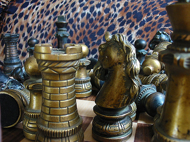
this photo seems a little too busy to me. also, i dont like the leopard print background - i think it would have been better with just solid white or black
Nice concept. Maybe it's me, but isn't this a little too close? Just wondering....(no score effect) why leapard skin background? Photo 8 Creativity 7 (I like the jumbled look!) Games 8 total 8
Yay -- the chaos that most of us feel about chess because we only barely even know the rules. Only two comments. First, I would have turned the knight slightly counter-clockwise so we can see it's face a little better and to get it lit more than just on the mane. Second, I'm not sure the leopard print background is the best choice for the picture. I don't have a better suggestion, but it just seems out of place.
I really like this picture, but I have some problems with it. The knight is a wonderful piece with some great detail. I would have loved if I could have seen its front, at the very least, turn it 45-90 degrees to the right so that its not backlit. The focus appears to be mainly on the fallen pieces. This is fine except that you have two pieces right in the middle obstructing the view. I think in this case focus should have been on those two pices. I like the way you used the piece all the way to the right to frame the photograph. I have no problem with it being out of focus. I also dislike your background it is too noisy and detracts from your subject.
This is a really nice photo.. I love your chess set. The only thing I don't care for in this shot is the background. I won't say that it's distracting, but it doesn't really fit this artistic chess set. With both colors of chess pieces being on the darker side, I would have tried to set them off a little more with a lighter colored (solid) background possibly.
That must've been one hell of a battle! Good job on having the front piece at the side blurred, makes me feel I'm right there on the chessboard. Also like the pieces, and how you've photographed them, however, the background is very distracting in my opinion, and the same photo with a plain black background would've scored higher with me.
I like the concept. It does indeed have the look of a battlefield. Good job with depth of field, but it could be a little better. Some objects that are mostly in focus are a little fuzzy around the edges. Looks like one of the better entries.
The way chess was meant to be played ; ) I'm not that fond of the background, it is interesting, but I wish it was consistent throughout the image - especially in the upper left corner






 Add photograph to your favorites
 Add photographer to your favorites


