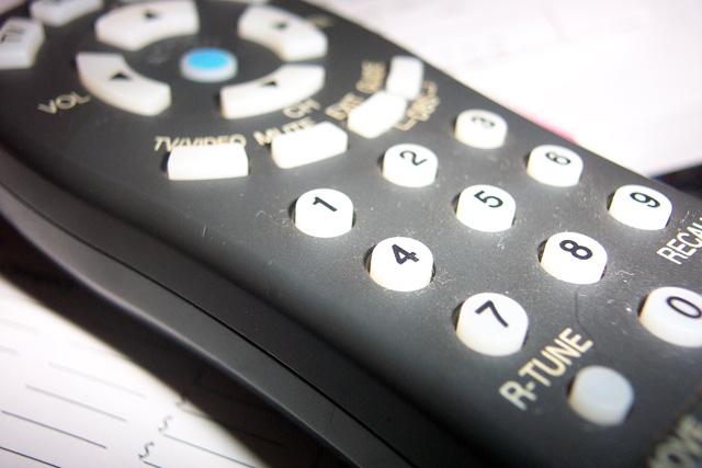
An interesting subject. The highlights are a little blown out. Also, the subject is a little dusty - I often use a little paintbrush to dust off macro subjects.
I don't define this picture as minimalism and it is not sharp or any special focus point that makes the picture attractive. Don't loose interest or confidence in yourself though, I have ended in the bottom 2% and DPC is a place to learn to do better;-)
For me the main thing about this picture that keeps it from being really great is the choice of subject. Maybe it would have been better had you taken it from so close that it was no longer recognizable. I think a couple of things could have been done to make this particular shot better though. First off, I have found that for photos of items like this, it is best to really clean everything off so that there is no dust or anything visible. Also, I think that the paper that the remote is sitting on doesn’t add anything to the picture. Maybe a white sheet would have been more effective.
Not sure what is your main subject here. If it is the blue button it does not stand out. The slight red is a bit of a distraction and the buttons are a bit over exposed.
Where to start from... The use of the flash harms the picture. The dust scretches does not help at all. Washed out colours. There is a pretty good dof. As for meeting the challenge I still try to figure it out. Sorry!
I think that this photo would get better scores if it fit into the parameters of the contest guidelines. The subject of this shot is very large, rather than occupying a small portion.
This is probably more of a macro shot than a minimalist shot. That said, I think the shot could be improved with a greater depth of field to ensure that all of the remote is in focus. The lighting is also a bit harsh - I'd like to tell you how to improve that but I honestly don't know much about it. Also, it would be better if the remote was free of dust. I hope this doesn't come across as harsh -- just trying to help :)
The bright whites are a bit hard on the eyes, but the use of depth of field is interesting. The subject, taken as the entire number pad, takes up a large part of the image, but conforms to classic minimalism, so no points docked for that.







 Add photograph to your favorites
 Add photographer to your favorites


 Photographer found comment helpful.


