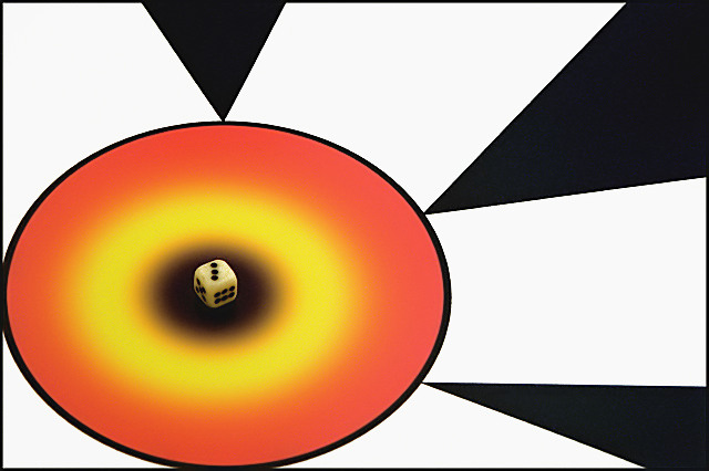
Aside from the drab looking die in the middle, this looks like something out of a comic book. Since the background so forcefully directs my gaze toward the die, it would be nice if it were better lit / more interesting.
Wowsers !!! This shot has a lot going on that I really like about it. Where to begin? This is hard to compose a comment, as I am very compelled to keep looking at the photo. It seems almost hypnotic. Cool. Let's see, the composition overall is awesome, it would almost seem at first glance to be too busy for the challenge, but everything works together so craftfully to take the viewers attention to the main subject, the die. The presentation is vibrant, the brightly colored rings, the highly contrasting black and white, the shapes and patterns, the leading lines, wow. On a large scale, the designs form like a giant arrow, leading the eye to the "bullseye", where dead center is...the DIE. This is excellant, I'd love to hear how you set up and executed this photo. Truly brilliant, IMO. (if you can't tell, I really like this, a lot)
I love the colors in this abstract photo. Good play on the challange. Only one thing...it would have been nice if the dice piece was more white. Just my opinion. :-)





 Add photograph to your favorites
 Add photographer to your favorites

 Photographer found comment helpful.


