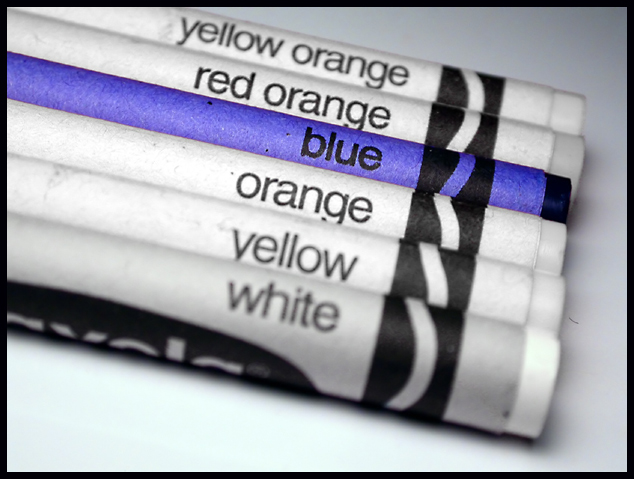
Composition - One of my fav's of the crayon pics this week. I really think the framing was the key in this shot. It shows enough of the crayon but not too much. I think maybe having the crayons go all the way across the frame would've been a good alternate to having only a few on each side of the blue one. I think if you would've done something like that though, the aperture would have to be turned down to get the "select" focus on just the blue one. I don't know if that's a real photography term, but I think you know what I mean. But as it is it is a solid composition.
Technical - Well taken. This is one where most folks would choose the shallow or great DOF. You chose in the middle. I think any way you did it it would work ok. With more crayons, I'd say go shallower, and with this many, if I did this pic, I'd have made it greater. I think its all a matter of personal preference though. Good work in the editing of this photo to do the desat of all colors but blue. Great idea.
Overall - I really liked this photo and think you got the short end of the crayon in your score. It is not a candidate for "winner" like your pi pic, but definitely a very good photo. The only thing I find odd about this as I look at it one last time is the white crayon has a little different hue to it than the others. Could be just the shadows but I suspect it might have just an iota of blue in it to keep it from completely desaturating. All in all I think its a good pic. Keep up the good work. - Inspzil
I love it wheb single colors stand out in the gray surroundings. Was this done by desaturation, or did you use gray crayons with your own labeling. It looks cool :)
great idea! great image! love the message. Wishing for a bit more dof to incorporate the white.. but the dof on the last crayon is good. That is just a nit pick. love the theme!
I think that in technical aspects, this shot was well done. However, the lack of color in the crayons that have the color written right on them seems weird. I see what you're getting at but that part just didn't work for me.
I love this effect. While I am of the personal opinion that it should not be allowed on DPC, I certainly won't vote you down for that now, because it is currently allowed. 8.
Love it.. So clean and simple. Nice detail with the DOF and focus on the blue crayon only. Great framing... Slight cyan cast in front of the white crayon (couldn't desaturate in PS? Forget to?) This is my fav for this week.. 10
Great approach... Looks a bit better as a thumbnail, unfortunately. It looks like the desaturation has left a few stragglers which detract from the overall shot. Tight focus on the blue crayon and the shallow DOF work very well in keeping the focus on the main subject.





 Add photograph to your favorites
 Add photographer to your favorites


 Photographer found comment helpful.


