Author Thread Comments Made During the Challenge
Post actions
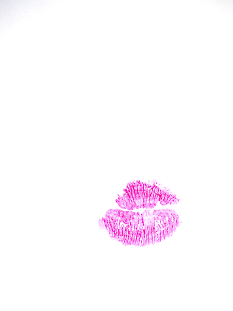
Is there something scratched into the lipstick? I think I see characters.
Post actions
Post actions
Post actions
I would have liked to see a fuller impress of the lips and the upper corners are a bit dark. 8
Post actions
Post actions
good idea, the result could have been better imo. for example in your two upper corners you have a grey gradient.
Post actions
It's a good concept, but the lip mark seem a bit washed out or out of focus
Post actions
Cute idea, but the color is unappealing.
Post actions
Really good! I love it. That´s one of the most original ideas of this week. I love people who can innovate. 10
Post actions
it would have been better if the peck was on the cheek instead of the paper!!
Post actions
very interesting, gray in the upper corner though.
Post actions
love it! i had thought of that idea but my bf said he didn't think it would do very good. but i'm glad someone did it!! good job
Post actions
Very simple but very well done. I am surprised no one else had thought of it. I gave it a 7.
Post actions
Post actions
Kiss is a way to go. at the top left hand corner it is a little darker than the rest.
Post actions
A little gray top right and left
Post actions
Creative thinking for this challenge. WTG
Post actions
Post actions
I like this - simply done, bare minimum of color, offers texture and contrast. The only drawback I see and maybe you can't see on your monitor is vignetting in the upper corners.
Post actions
Post actions
Cute, and almost funny. The bright white backdrop hurts my eyes, though, and the tedium is broken only by the upper left hand corner. Adding something to break up the background (even blue lines from school paper) would have helped.






 Add photograph to your favorites
 Add photographer to your favorites


 Photographer found comment helpful.


