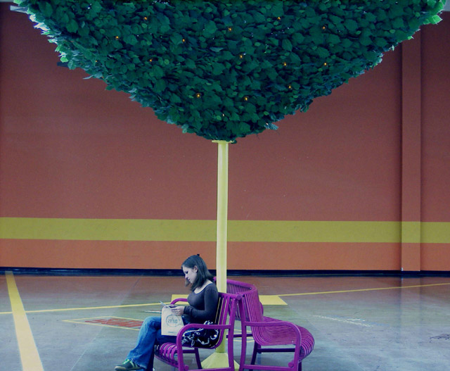
The colors here seem very odd. Most of them look washed out, while others look a bit over-saturated (the bench in particular). I like the composition though.
I like the colors a lot. However, it seems like maybe the image could use a little more color contrast, for example to make the black shirt a stronger black and the green in the tree a little stronger. The lines created by the floor, the wall, and the tree "stump" are really nice. The image seems plenty sharp, too.
I find that the deep purple benches are competing with your subject. There is a lot going on in this photograph that distracts me such as the lines, color and tree??. I believe it would of been better if you would of cropped the left side out placing the subject more to the left. It would of eliminated the yellow line on the floor to the left that leads my eyes away from subject.
too snapshotting, the colours are off, the film speed is too high, the lighting is bad, and the skintones are funny, i don't really understand the idea of this one either, barely fits the challenge, 1
White point correction would have improved this photo considerably, I think. I also think the composition might be quite a lot stronger if the whole right half were cropped off. Finally, I think the line running through the subject's head would be better placed well above it or below her hands.







 Add photograph to your favorites
 Add photographer to your favorites


