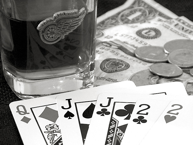
Challenge:Games (Classic Editing) Camera:HP PhotoSmart C618 Location: poker table Date: May 16, 2002 Aperture: 1:4.0 ISO: auto Shutter: 1/4s Date Uploaded: May 17, 2002
You had some nice colors to work with here (whiskey, cards, greenbacks). I wonder what made you decide on B/W (this from a B/W fan). Some oversharpening shows on the cards and glass, and a little more DOF to include the logo on the glass in the field of focus would have helped since it's near a hotspot.
Good setup. If I was to suggest changes, I would use a plain glass and not make the picture b&w. The colors of the cards and the money would've looked good here, I think
Ack Red Wings fan. :) Don't worry I won't hold it against you. This is a really nice photo. I like the focus on the cards and blurred out in the background.
This is a very nicely executed layout for this challenge... I can't make up my mind if I like the redwings logo on teh glass... mainly because I can't sort out in my mind if I want this photo to look antique or modern... For a modern look, I would like to have seen the photo in color. For the antique look, I like the black and white, or possibly a sepia tone even moreso. "Deuces Wild" would have been an exciting title for this photo too! Good job! = 9
Great clarity - GREAT choice in hockey teams!! but I find my attention drawn away to the emblem on the glass. Perhaps poker chips instead of a glass? good job though!!





 Add photograph to your favorites
 Add photographer to your favorites


